文章导语
大家好,这里是斗斗图。探索无限创意,尽在斗斗图--您的优质设计资源宝库,发现灵感新篇章!
今天为大家带来是关于[ 字体 ]的一个分享,标题为:【 【Markazi Text】一种对比度适中的免费英文字体】;下面就跟我通过本文一起来详细的了解一下吧!
内容介绍
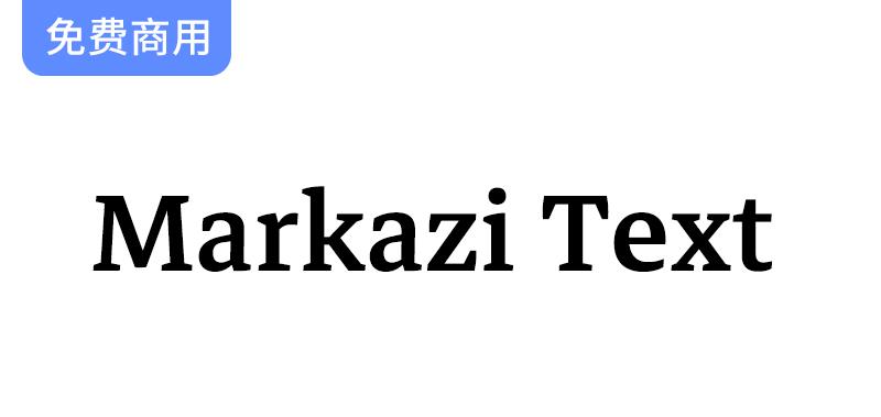
这种字体设计的灵感来自Tim Holloway的Markazi字体,在他的鼓励下,由Gerry Leonidas作为雷丁大学和谷歌的联合项目发起。阿拉伯字体由Borna Izadapanah设计,Fiona Ross指导设计,是一种对比度适中的文字字体。它从屡获殊荣的Markazi字体中汲取灵感,提供了一种现代且可读性强的字体。补充拉丁字体是由Florian Runge设计的。它与阿拉伯同行保持着精神上的一致,呼应了关键的设计特点,同时植根于既定的拉丁传统。这是一个开放和清晰的设计,紧凑的立场和流畅的节奏。阿拉伯语和拉丁语都有四种重量,并提供适用于打印和屏幕的扩展语言支持。
This typeface design was inspired by Tim Holloway’s Markazi typeface, with his encouragement, and initiated by Gerry Leonidas as a joint University of Reading and Google project. The Arabic typeface, designed by Borna Izadpanah and design directed by Fiona Ross, is a text typeface with moderate contrast. It takes its cues from the award-winning Markazi typeface, affording a contemporary and highly readable typeface. The complementary Latin typeface was designed by Florian Runge. It keeps in spirit with its Arabic counterpart, echoing key design characteristics while being rooted in established Latin traditions. It is an open and clear design with a compact stance and an evenly flowing rhythm. Both Arabic and Latin are available in four weights with extended language support suited for print and screen.







请登录后查看评论内容