文章导语
大家好,这里是斗斗图。探索无限创意,尽在斗斗图--您的优质设计资源宝库,发现灵感新篇章!
今天为大家带来是关于[ 字体 ]的一个分享,标题为:【 【Tilt Prism】灵感来自店面标识中的立体字体】;下面就跟我通过本文一起来详细的了解一下吧!
内容介绍
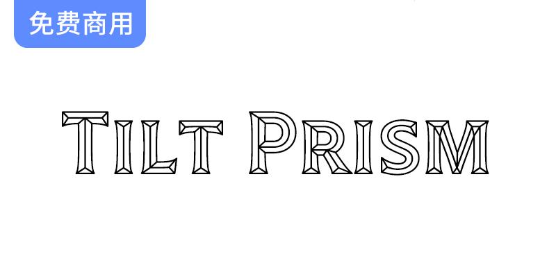
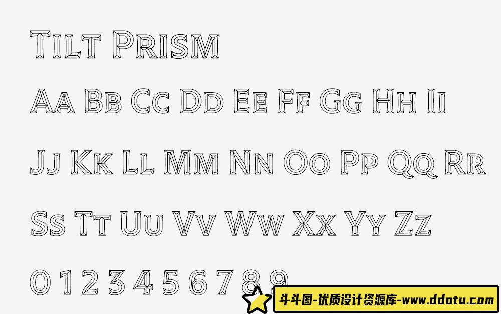
Tilt字体系列的灵感来自店面标识中的立体字体,由Andy Clymer设计。它由三种相关的可变字体样式组成,您可能会在商店橱窗中找到
● Tilt Neon模仿霓虹灯灯管的结构,
● 倾斜棱镜是基于棱柱形刻字,铸造或切割在一个材料,
● Tilt Warp类似于脱皮的乙烯基贴纸。
这三种字体都是基于一个标识画家的几何无衬线字体的相同字母模型,类似于Futura或Avant Garde字体,但有一些你可能会在用画笔绘制字母时看到的细节。
这三种样式被设计和构建为可变字体。这些字体允许用户使用“旋转X轴”和“旋转Y轴”来旋转字形的方向,而不是使用您期望找到的“重量”和“宽度”等变化轴。旋转限制在±45°,这样字体就不会旋转超过可读范围。
Tilt is a family of type inspired by the dimensional lettering found in storefront signage, designed by Andy Clymer. It’s comprised of three related variable font styles that you might find in a shop window —
● Tilt Neon mimics the construction of neon tube lettering,
● Tilt Prism is based on prismatic lettering, cast or cut in a material,
● Tilt Warp resembles peeling vinyl stickers.
All three are based around the same letter model of a sign painter’s geometric sans serif, similar to the typefaces Futura or Avant Garde, but with the kinds of details you might expect to see when the letter is built up with a brush.
The three styles are designed and built as variable fonts. Instead of using variation axes that you would expect to find, such as “Weight” and “Width”, these typefaces allow users to rotate the orientation of their glyphs with “Rotation in X” and “Rotation in Y” axes. The rotation is limited to ±45° so that the letterforms never rotate past a readable range.



![[婚纱情侣RAW原图]7张影楼中式古装婚礼人像摄影RAW原图练习素材-斗斗图](https://www.ddotu.com/wp-content/uploads/20241210083056-6757fc408ee26.jpg)

请登录后查看评论内容